You’ve likely stumbled across this article because you’ve heard of color analysis and want to know what it’s all about or want to find your season. Let’s deep dive on what color analysis is and how it uses color theory to help you find your most flattering clothing, hair and makeup colors!
Why Some Colors Look Good on People
Ever wondered why certain colors make you look vibrant while others make you look a bit off? It all comes down to how the colors you wear interact with your natural features like skin tone, eye color, and hair color. Colors that harmonize with your natural pigments can enhance your overall appearance, making you look healthier and more energetic. Conversely, colors that clash can make you look tired, dull, or washed out. This is because each color in clothing can reflect onto your face and affect how your skin tone appears.
Interaction with Skin Tone
The color of your clothing can reflect onto your face, influencing how your skin tone appears. For example, if you have a cool skin tone with blue undertones, wearing a warm orange top might make your skin appear sallow. Conversely, a cool blue might enhance your skin, making it look clear and bright.
Highlighting Features
The right colors can also highlight your best features. For instance, someone with green eyes might find that wearing shades of green or colors with green undertones, like certain greys and blues, can make their eye color pop, making them appear more lively and attractive.
Creating Visual Harmony
Colors that complement your natural coloring help create a sense of visual harmony. This is why color analysis is often used not just in fashion but in professional settings as well. For example, someone who works in a business environment might choose to wear colors that enhance their natural tones to convey confidence and professionalism.
Emotional and Psychological Effects
Colors not only change how others perceive you but also how you feel about yourself. Wearing colors that you know look great on you can boost your self-esteem and confidence. For example, wearing a bright color like yellow can evoke a sense of happiness and energy, which is palpable to both the wearer and the observer.
What is Color Analysis
Color analysis, also known as personal color analysis (PCA), is the process used to determine the colors that complement your natural coloring the best. The goal is to identify the colors of clothing and accessories that harmonize with your skin complexion, eye color, and hair color. This technique stems from the theory that each person can be matched to a season—Spring, Summer, Autumn, or Winter—that reflects their coloring. This concept has evolved into more nuanced systems, such as the 12 season color analysis, and the 16 season color analysis which offers a more personalized palette.
A Brief History of Color Analysis
The roots of color analysis can be traced back to the early 20th century, but it wasn't until the 1980s that the practice gained mainstream popularity. The idea was initially influenced by the work of artist Johannes Itten, a Swiss color and art theorist who taught at the Bauhaus. Itten observed that his students worked better with colors that complemented their natural skin tone, eyes, and hair. He developed a color wheel that helped categorize these colors into what he referred to as "seasons."
In the 1980s, Carole Jackson popularized this concept with her book "Color Me Beautiful." Jackson’s work expanded on Itten’s theories by associating specific color palettes with the four seasons—Spring, Summer, Autumn, and Winter. This approach suggested that people could enhance their natural beauty by wearing colors that reflect their seasonal type.
Evolution into a Nuanced System
Over time, the original four-season model was found to be too limiting as it did not account for the subtle variations within each season's palette. To address this, the system was expanded into the 12-season color analysis. This more detailed system includes three variations per season—True, Light, and Soft for Spring; True, Cool, and Light for Summer; True, Deep, and Warm for Autumn; and True, Deep, and Cool for Winter. This allows for a more precise and tailored approach in selecting the best colors for an individual, considering their unique undertones and contrast levels.
Modern Applications and Benefits
Today, color analysis is used not only to enhance personal style and wardrobe choices but also in makeup selection and branding, where the right colors can convey specific messages or evoke desired emotions. Knowing your colors can save time and money by streamlining wardrobe choices and boosting confidence through clothing that complements your natural appearance.
Understanding Color Theory: Hue, Tint, Tone, Chroma
To get deeper into color analysis, it's essential to understand some basic color theory:
- Hue: This is essentially what we think of when we say "color." Hues are the basic colors on the color wheel—red, orange, yellow, green, blue, indigo and violet.
- Tint: A tint is created when white is added to any hue, lightening the hue but not affecting its basic color. For example, pink is a tint of red.
- Shade: A shade is created when you add black to any hue, darkening the hue but not affecting it’s basic color.
- Tone: Tone is produced by adding both white and black (which is the same as adding gray) to a color. This modifies the intensity and brightness of the hue, often making it more subtle.
- Chroma: Also known as saturation, chroma refers to the purity of a color. A color with high chroma has no black, white, or gray added to it. It is vivid and intense, while low chroma colors appear more muted and greyish.

How These Terms Play Into the 12 Season Color Analysis System
The 12-season color analysis system expands on the traditional four seasons by adding more specific categories that consider hue, chroma, and value (the lightness or darkness of a color).
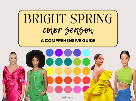
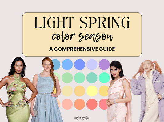
Spring
Spring types are generally characterized by warm, clear, and bright hues. The vitality and freshness of spring are mirrored in the high chroma and lightly tinted hues found in this palette.
- True Spring: The quintessential Spring palette includes clear, warm colors with high chroma—think of crisp, sunny colors like lemon yellow, clear sky blue, and grass green. No muted or dusty colors are found here.
- Light Spring: This subseason mixes the lightness of Spring with softer tints, featuring pastel shades that still maintain some warmth. Colors are less saturated than in True Spring, leaning more towards soft peach, soft turquoise, and light moss.
- Warm Spring: Emphasizing a slightly muted tone with warm undertones, Warm Spring colors are like an autumnal sunset with a spring twist. Think of golden yellows, coral, and softer browns that are bright but not as intense as True Spring.
Summer
Summer's palette is cool and muted, with soft hues reflecting a gentle, refined look. The colors here have lower chroma and subdued hues, emphasizing tints and tones that are understated.
- True Summer: Cool and soft with muted tones, True Summer offers a range of blues and pinks, all with a washed-out, gentle appeal. These colors are sophisticated and subtle, avoiding any stark or bright contrasts.
- Light Summer: Incorporating lighter tints into the Summer palette, Light Summer features pale but cool colors such as lavender, light raspberry, and cool pastels that suggest a delicate, breezy summer day.
- Soft Summer: This sub season focuses more on the dusky tones of Summer, blending coolness with a touch of depth. Think of softened plum, grayish-blue, and dusty rose, providing a richer, yet still muted palette.
Autumn
Autumn palettes are all about earthy, rich, and muted tones with warm undertones. These colors are deeply saturated but not bright, reflecting the season's essence of warmth and depth.
- True Autumn: True Autumn features a robust and earthy palette that includes burnt orange, olive green, and deep golds, all with high chroma and warm undertones, but muted, not bright.
- Soft Autumn: Blending the softness of muted hues with the warmth of Autumn, Soft Autumn includes taupe, soft pumpkin, and mossy greens that are less saturated than True Autumn, offering a gentler take on the season.
- Deep Autumn: Emphasizing depth, Deep Autumn includes the darkest and most intense colors of the palette, like dark chocolate, deep terracotta, and rich mahogany. These are warm tones deepened by darker shades, creating a bold, substantial look.
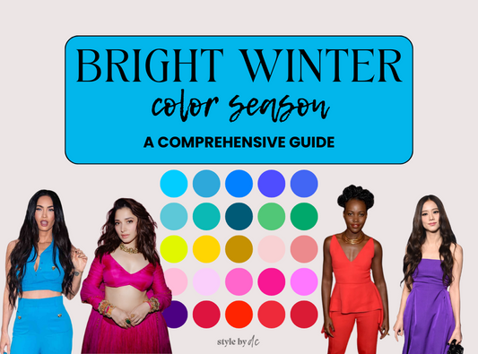
Winter
Winter types flourish in bold, clear, and cool colors. This palette includes the most saturated hues, often with a stark, icy quality, reflecting the clarity and contrast of the winter season.
- Bright Winter: True Winter's palette is sharp, clear, and cool. Colors like icy blue, hot pink, and true red stand out with high chroma and deep tones, capturing the crispness of a frosty winter's day.
- Deep Winter: Combining the intensity of Winter with darker shades, Deep Winter includes colors like black, deep wine, and forest green. These tones are rich and powerful, offering high contrast against lighter colors.
- Cool Winter: Highlighting Winter's coolness, this sub season focuses on slightly less intense, yet still vibrant colors. Think cool rose, bright navy, and lavender. These colors maintain Winter's coolness but soften its edge slightly.

Understanding these elements can help you identify which season you fall into within the 12-season system. For example, if you look best in bright, vivid colors, you might be a Spring or a Winter. If softer, muted colors are more flattering, you might be a Summer or an Autumn. Some people are able to figure out their season and even sub season based on this information alone - but, when going through a professional color analysis there are several things that are checked or taken into consideration to help you figure out which colors will be most flattering. These include:
- Undertone. Your undertone will determine if your skin will be complemented by more warm or cool colors. Some undertones are neutral and can get away with either warm or cool colors - but most people lean one way or the other.
- Contrast. The level of contrast between your hair, skin, eyebrows, eyes and lips offer insight into whether lighter or darker colors will look best on you. For example, if you have dark hair and eyes and light skin - you may appear “washed out” by lighter colors whereas a darker or deeper shade of a color will create a nice level of balance.
- Skin qualities. How bright or soft your skin is also plays a role in what type of colors will look best. If your skin appears “bright” meaning that it almost looks clear and glowy without makeup - you will likely be able to find good balance with bright colors without them being too overwhelming. If your skin appears more soft and subdued, you will likely look great in more subdued colors, without having the “washed out” effect.
Because there are several factors to look at - it can be tricky to find which season is best without an untrained eye. Some people have very easy coloring to match up to the qualities of any of the seasons whereas others may not easily fall into the typical description of the seasons and may need to do a bit more in person testing for finding their perfect colors. A virtual color analysis can be a great way to start to explore color - especially if you understand why certain colors look harmonious and why some don’t.
By incorporating these color theory basics into the 12-season color analysis, you can better understand why certain palettes enhance your natural beauty more effectively than others. This knowledge not only helps in choosing the right colors for your wardrobe but also in makeup and accessory selections, ensuring a cohesive and harmonized look.